Team Fortress 2 (“TF2”) is easily identifiable: the bright colored planes and precise geometry is totally unique in games. Actually, it was totally unique until this year (2009), as other developers have emulated Valve’s style, namely Electronic Arts and Digital Illusions. Still, in the First Person Shooter (“FPS”) genre, TF2 sticks out because its simplistic art style is the complete opposite of all of the other games out there that stress realism. Check out screenshots of Crysis, Call of Duty, and Killzone… and then compare those to this screenshot of TF2.
While those other games are indeed beautiful, the art style doesn’t tell us anything about the game. From those pictures all we can tell is that Crysis, Call of Duty, and Killzone are going to be realistic (or at least try to be), while TF2’s style let’s us know before playing that this going to be goofy, fun, and not realistic! In doing so Valve allows the player to jump into the fun without having to worry about if the game looks or feels real enough.
Digital Illusions and EA probably wish they knew this in 2005 when they released Battlefield 2… a game that is eerily similar to what TF2 was going to be had Valve decided not to delay the release. For a while it looked like Valve was going to release a modern, realistic, class based war simulation. Battlefield 2 was exactly that. But what Valve realized was that a realistic look to a game that features rocket jumping, capture the flag, cloaking abilities, and a method of construction that boils down to just beating something with a wrench isn’t realistic; basically Valve remembered that Team Fortress was supposed to be a fun and competitive game. While Valve went back to the drawing board, Digital Illusions and EA released Battlefield 2, which was by no means a war simulation. For instance, in Battlefield 2, I could jump out of a multimillion dollar fighter jet and parachute down behind enemy lines and take out an entire enemy squad before capturing a control point, just to have that exact same squad appear out of nowhere next to me before I climb into an empty enemy tank and, in an instant, drive away from them while simultaneously shooting the tank’s main cannon and the machine gun). Battlefield 2 was a fine game, but why try to kid us with the realistic graphics if the scenario I just described was a big part of the gameplay. To be fair, realistic graphics is what we all wanted for a long time, and only a few developers out there had the fortitude to go against the grain and release games that didn’t stress realism. Developers such as Nintendo and Smilebit challenged the notion that games should emulate real life. Those studios made games where the art style fit the gameplay. (Oh, and Digital Illusions is now obviously exploring a new art style with Battlefield Heroes).
Through testing Valve realized that they were lying to the player with realistic graphics. If this was supposed to be a fun game, why should it try to look so serious? Over the years (and years and years) of development the brilliant people at Valve settled on an art style used by J. C. Leyendecker and Norman Rockwell to design the characters of the game. Basically, this 1960s illustration method stressed the silhouettes of figures so that they were easily identifiable even with just a quick glance, even from a distance. This style was used primarily in advertisements to quickly capture peoples’ attention. The decision to embrace this art style has been discussed already, and you can read an incredible paper written by some members of the Valve art team on this topic and about the lighting methods used in the game. However, I wish they expanded a bit more on the architectural significance of the art style they chose, and how closely they emulated the Precisionist movement from the early to mid 20th Century.
Maybe I’m just not digging deep enough, but as far as I can tell there has been no discussion about how Team Fortress 2 utilizes the elements of the Precisionist movement when it comes to level design and theme. I am surprised I haven’t seen any articles about elements of this art style found in the TF2 landscape when, to me, it looks obvious that Valve level designers have nearly plucked structures from some of Charles Sheeler’s work! Now, I’m not accusing the level designers of “copying” Sheeler or other Precisionist movement artists; I just can’t believe that such an obvious inspiration for theme and level design has gone completely under the radar.
Precisionist art is characterized by “sharply defined, geometric forms and flat planes” that depicted “smokestacks of the modern city or the barns, farmhouses, and agricultural machinery” of rural America (The 1920s, 273). It stemmed from the European Cubist and Dada movements as it was heavily influenced by the simplicity of those other schools of art, but it also embraced a very American style that separated itself from those other 20th Century forms. The Precisionists painted early America in a very mechanized and streamlined way, which contrasts with the art of the mid to late 1800s that had romantically emphasized the wildness of Middle America. However, the “Manifest Destiny” feeling is still relevant in the work of the Precisionists. Not only is the heavy usage of patriotic colors a clear example of this, but the powerful, rising imagery employed in this style exemplifies this notion as well. Precisionist works are created with streamlined and efficient American landscapes, in order to symbolize the powerful growth of the union and its perceived role as the leader of the future, more mechanized world.
(Sorry to step away for a moment, but I want to stress that playing Team Fortress 2 is all about fun, and one should not engross themselves in artistic discussion whilst waiting for a Pyro to stick his/her head out of Blu’s fort. Although game design is also fun, it is also a creative and scientific practice that must be dissected in order to discover a game’s true brilliance as an artistic form. This game’s art is not only an artistic achievement in how it employs a forgotten era of American art, it is an achievement in game design as it is used to convey gameplay information a streamlined and playful way.)
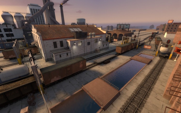
Back to Team Fortress 2’s level design… Team Fortress 2 incorporates the nationalism, the industrial and farmland themes, and the efficiency of Precisionist work within its architecture, (at the bottom of the page you can see a series of images of some Precisionsit work and architecture from Team Fortress 2).
Think about the powerful, towering bases of the two teams in 2Fort, the smokestacks off in the distance in Well, and the Grain Silos and haystacks in Granary. Think about how the logos of team Red and team Blu are spread out across the level, how the colors of their respective bases stress ownership, and thus evoking the prideful attitude that can be felt in Precisionist work. And think about the textures that you see, the sleekness of the design and the simple geometry, and bold ridges and borders that outline the structures.
Precisionism, I argue, is the foundation of the art style and the theme utilized in Team Fortress 2’s level design. As Valve incorporates an art style beyond realism, they also affect the psychology of the player in a way that realism could never do and with the same symbolic notions that are captured in Precisionist art. In my opinion, the care and thought that went into creating Team Fortress 2 is so incredible and inspired that the end result is digital gaming’s first true masterpiece.
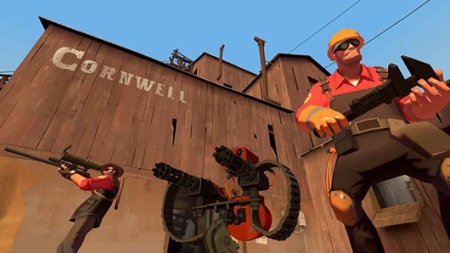
Team Fortress 2
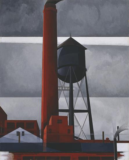 Chimney and Water Tower, Charles Demuth, 1931
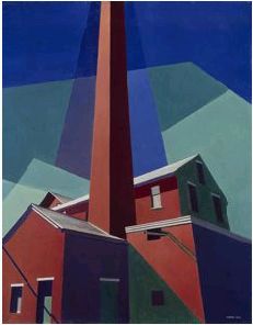
Ballardvale, Charles Sheeler, 1946

TF2: 2Fort
Buffalo Grain Elevators, Ralston Crawford, 1937
TF2: Granary
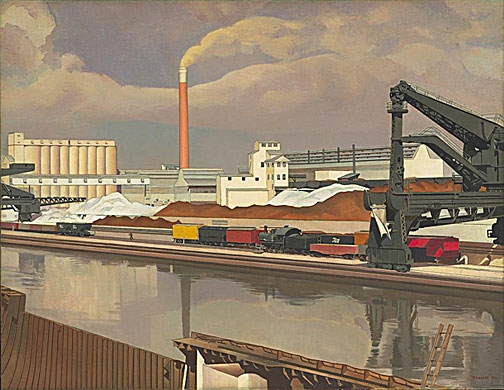 American Landscape, Charles Sheeler, 1930, The Museum of Modern Art, NY
Fugue, Charles Sheeler, 1940, Boston MFA



What I’d like to know is *who* in Valve had the vision to turn TF2 into a post-modern satire of first person shooters and mid-century action films. That *person* was brilliant, and I wish we could see who it was.
i just stumbled upon the wikipedia article for “precisionism” (had never heard of it), where i saw some of the images you include here, and immediately thought “holy shit that grain elevator thing looks like a screenshot straight out of TF2”
then did a google image search for “precisionism” and found this page. really interesting essay here, and cool image comparisons.
I know this is a paged from 2009, but I am happy to see someone noticed the architecture and landscape inspiration. While learning about precisionism in modern art class about a year ago I flipped out when noticing where valve got their inspirations from. It just shows you that those who acknowledge the past will create beautiful works.